Project
Russell & Bromley: Checkout Redesign
As the Lead UX/UI Designer on this project, I led on the end-to-end redesign of the Checkout. As part of Russell & Bromley’s ‘Experience’ Pillar, our goal was to design an exceptional, best-in-class checkout that reduced user friction and provided customers with a seamless checkout experience.
Objectives
1. Increase bag to order completion rate
2. Decrease negative customer feedback about Checkout
3. Enhance visual clarity, usability and accessibility
Outcomes
1. 27.6% Increase in bag to order completion
2. 11% Reduction in time to order completion
3. 83% Reduction in negative customer feedback about Checkout
Info
Role
Lead UX/UI Designer
Team
CRO Manager, Lead UX/UI Designer, Technical Lead, DevOps Lead, DevOps Team
Tools
Figma, Miro, Content Square, UserTesting
Timeframe
4 months
Project Timeline
I was recruited near the end of the project’s discovery phase, which was completed by our CRO team. As the UX/UI lead, I led the ideation, design, prototyping and testing phases of the project. Following a team sign off, this was followed by defining business requirements to our developers, and handed over to our development agency. Following the build, I worked collaboratively with our DevOps team during their testing phase to ensure the final checkout UI and functionality matched my designs.

Discover
Industry Articles
Drawing insights from a range of articles from the Baymard Institute, the team identified key do's and don'ts, including time-saving factors, a consistent user flow, and the importance of providing valuable information to reduce abandonment rates. Insights on best practice for form design were taken from Nielsen Norman group articles.

Competitor Analysis
A comprehensive analysis of over 30 e-commerce cart and checkout experiences was carried out by the CRO team prior to my onboarding onto the project, which informed my design approach. Comparisons involved analysing competitors and aspirational brands, considering elements such as delivery options, sign-in functions, express payment, and overall user experience.
Key takeaways included:
- Only 7% of our competitors use a single-page checkout design
- 60% of competitors have a mandatory cart as part of the checkout process
- 85% of competitors include the guest/sign in function, 83% include account sign-in
User Testing
Comparisons of the current checkout with 3 brands, identified in competitor analysis as ‘great’ checkout experiences - Apple, Ikea, and Space NK.
Key takeaways included:
- Users prefer a multi-step checkout approach - this was also backed by findings from industry articles
- Users expect a 'great' checkout to be 2 things: quick and easy to navigate
- A mandatory cart is expected by users, as it presents an express payment option, further cutting down on the time to complete a purchase
Define
The Problem
The current single-page checkout design was unconventional and required more 'effort to complete', leading to users' confusion and frustration. The checkout functionality did not match competitors and required a more user-centric approach.
“Checking out on the website was infuriating!” – CSAT Response, 2022
Several pain points were identified during discovery:
- Checkout completion rate was ~30% on mobile and ~50% on desktop
- 50% of negative customer survey responses were related to the checkout
- The current checkout defaulted to a sign-in process that required a password, encouraging high abandonment when passwords weren’t remembered
- The single page design made it difficult to identify where customers were dropping out of the process
Ideate
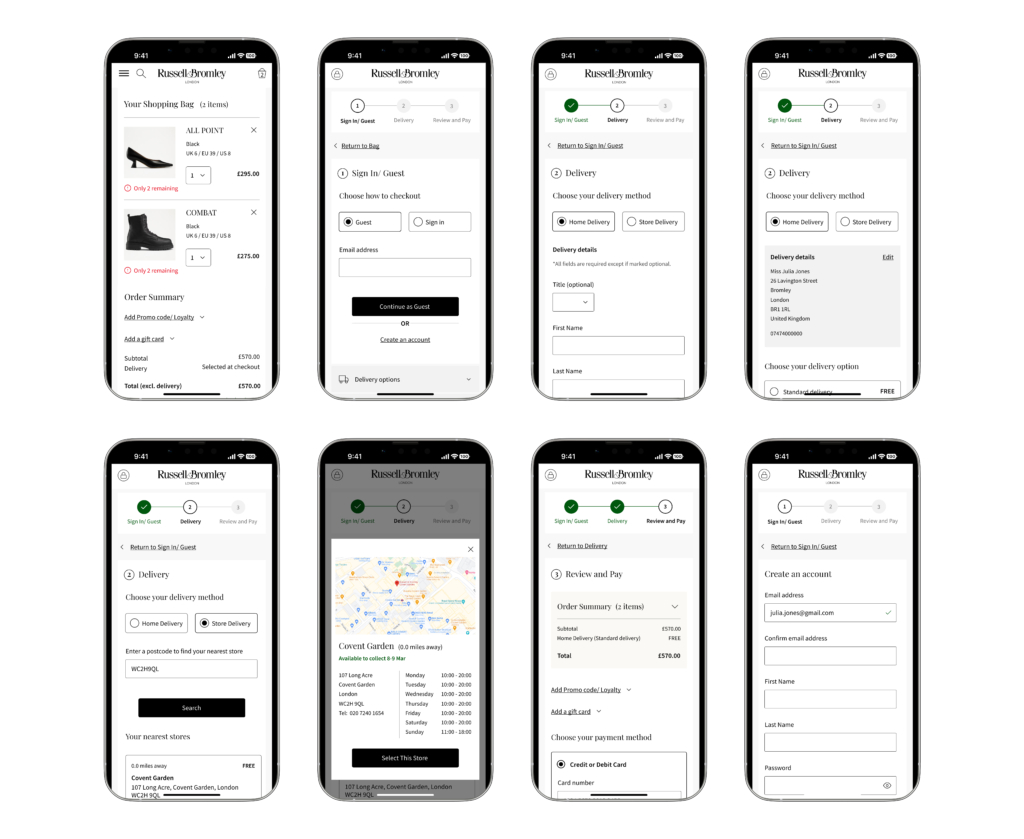
The design phase for this project was unique, with the progression from low to high-fidelity wireframes being extremely quick due to time constraints. A mobile-first approach was adopted as ~60% of users browse the Russell and Bromley site on mobile devices.
Ideation methods included:
- Mindmapping to identify non-negotiable checkout elements
- Sketches of low-fidelity designs to map out user flows
- User flows to visualize and consider a range of pathways


Iterate
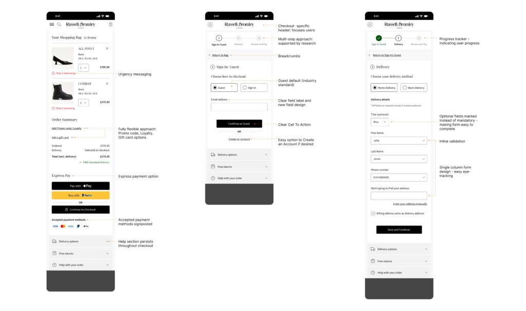
The design iterations were informed by insights from User Testing, collaboration meetings with the Head of Development and Technical Lead, and unique scenarios identified during the process.
User Testing provided us with the following crucial insights:
- Handling of promo codes in the cart was expected by 70% of users
- Users preferred estimated delivery dates over delivery speed
- Express pay was preferred by users over full checkout process – perceived as ‘more secure’
- Users preferred retaining sign in as an option instead of defaulting to guest
- Specific information in FAQs section throughout checkout – perceived by users as ‘helpful’
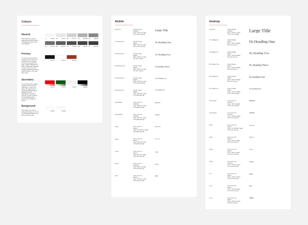
Styling Refresh

Cross-functional Collaboration
The collaboration after handing over the designs to developers involved assisting in the writing of the Business Requirements Document, ensuring a seamless transition from design to development. This provided me with experience and insight into the information required by developers, and gave the team the opportunity to predict all possible user journeys. Following 6 weeks of thorough testing in January 2024, the new checkout launched in March 2024.
Reflections
This project is one that I am extremely proud of, and have been left with valuable learnings for the future.
01.
Adapt your design process to fit the project
The ideation phase of the project in particular progressed rapidly to high-fidelity wireframes. Adapting to the pace of this project was crucial to meeting deadlines; every project doesn’t require every stage of the process.
02.
Collaboration is key
Working closely with the DevOps team throughout the project to understand the tailored features the checkout helped me understand specific functional requirements, and in turn, our collaboration during testing helped to share UX knowledge when it came to matching designs to final deliverables.
03.
Storytelling and stakeholders go well together
Breaking down the complex process of the project and effectively communicating how our research led to the final designs was crucial to final sign-off of the project. I learnt how to ensure that we made stakeholders feel confident that our proposal achieved the business’ goals.
Early metrics show that more orders are being completed without bugs or issues related to the checkout, resulting in a significant decrease in enquiries to the customer experience team. The outlook has been immensely positive, with an initial uplift of 27.6% in order completion, and a significant reduction in negative customer feedback.
Overall the project has been a huge success, all thanks to the fantastic team that worked on the Checkout.


